Redesigning an intranet for clearer knowledge discovery
My role
Visual / UX Designer
Year
2020
Project details
Client
ICA Gruppen
Sector
Retail / Employee experience
Project team
Product team including a Project Manager, Experience Strategist and a Visual Designer.
Timeline
12 weeks
Overview
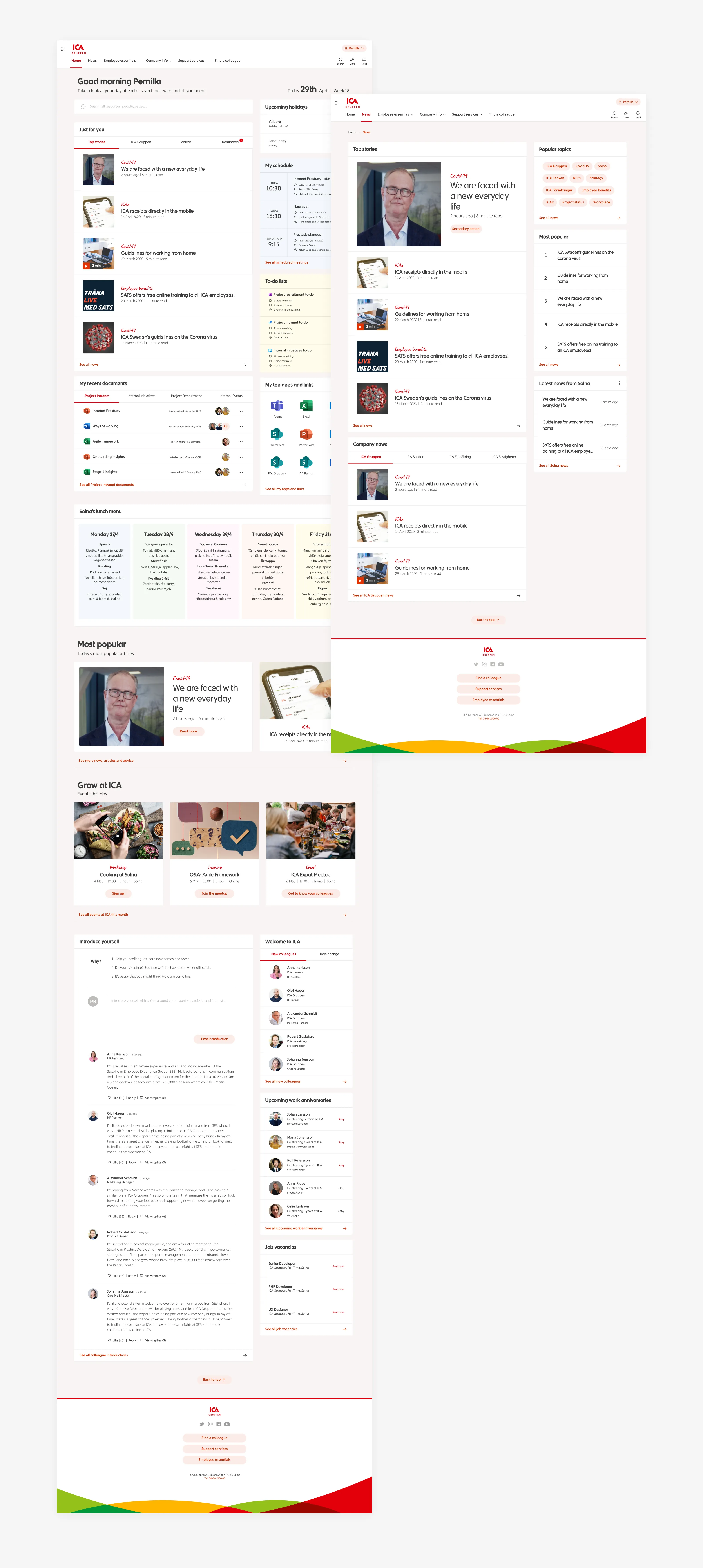
I led UX design for ICA Gruppen’s new intranet, creating a responsive employee experience within the constraints of the Omnia platform.
The existing intranet was fragmented and difficult to navigate. Employees needed a clearer way to find information, understand organisational priorities and access the knowledge, tools and updates relevant to their work.
The challenge was not to design a completely bespoke product from scratch. The solution had to work within Omnia’s platform capabilities, follow ICA’s brand identity and be delivered through a rapid two-week sprint cadence.
My role was to restructure the information architecture, design desktop and mobile prototypes, run usability testing, and help the team turn user and business needs into a clearer, more usable intranet experience.
The problem
ICA Gruppen’s intranet needed to work better as a central source of internal knowledge and communication.
Employees struggled to find relevant information quickly, understand what mattered most, and navigate content across different operating companies. The experience had too many competing links, inconsistent templates and unclear pathways into important information.
At the same time, the project had real delivery constraints. The design needed to align with ICA’s brand, work within Omnia’s platform configuration, and be delivered in a fast sprint cadence.
The main challenges were:
overloaded navigation and unclear information hierarchy
inconsistent design and branding across intranet areas
difficulty finding relevant knowledge and internal tools
unclear signposting of organisational priorities
the need for responsive desktop and mobile experiences
strict platform constraints from Omnia
My role
I worked as the lead UX designer, responsible for shaping the intranet experience across information architecture, prototyping, testing and handoff.
My work included:
reviewing the existing intranet experience
identifying navigation and usability issues
facilitating stakeholder workshops
capturing user and business goals
restructuring the information architecture
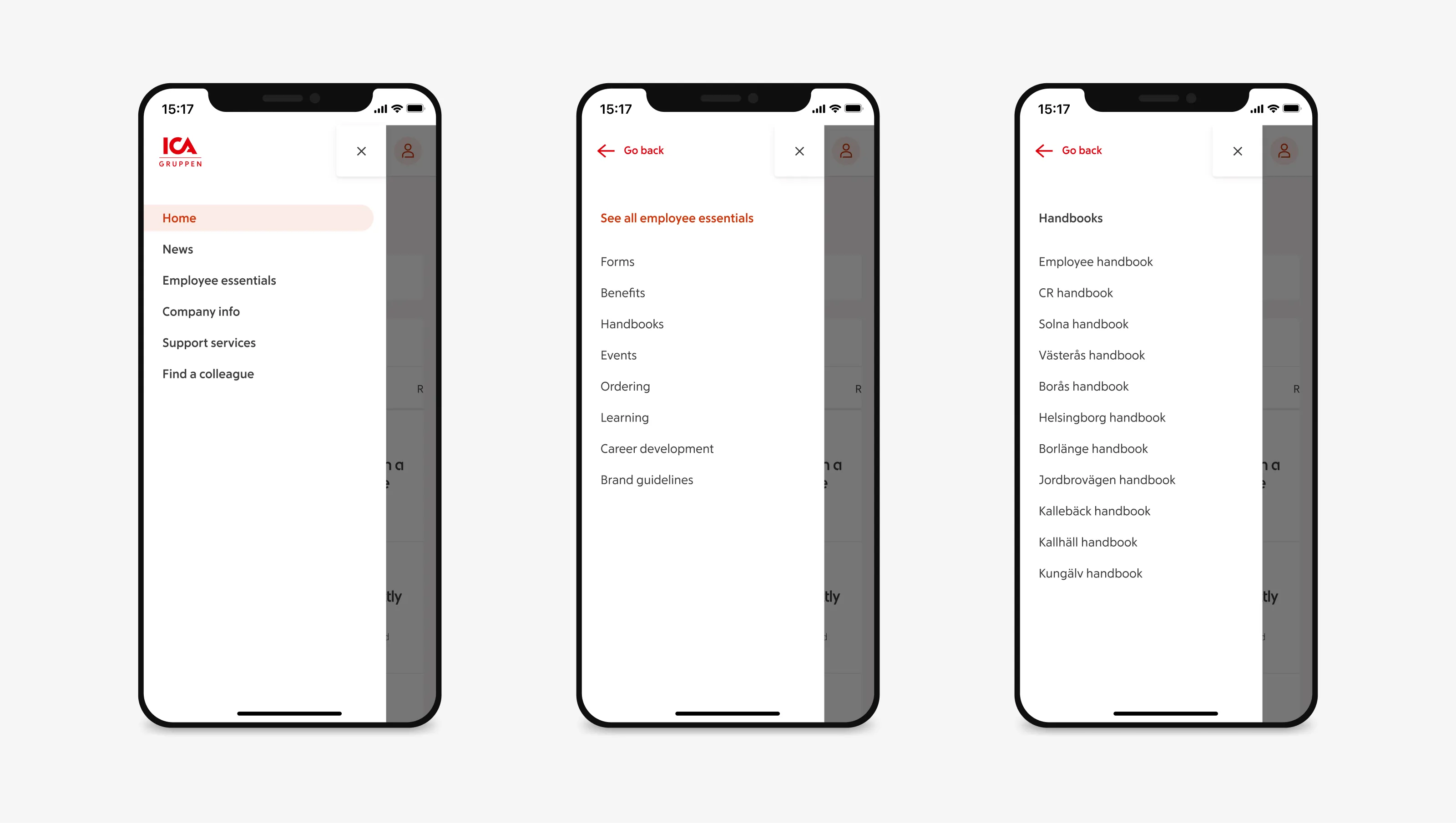
designing responsive desktop and mobile prototypes
testing prototypes with users at the end of sprint cycles
iterating flows, navigation and content layouts
aligning design decisions with Omnia’s platform capabilities
The project required a pragmatic approach: improving the experience while staying close to what could realistically be implemented.
Design approach
The main focus was to make the intranet easier to understand, navigate and use in everyday work.
Rather than treating it as a place to publish everything, the redesign focused on helping employees find what they needed and understand what required their attention.
The work balanced three priorities:
find-ability; so simplifying navigation and making important content easier to reach
clarity; so helping employees understand organisational priorities and next actions
feasibility; so designing within Omnia’s capabilities and the project’s sprint cadence
Key design decisions
Simplify the navigation structure
The existing navigation had too many competing links and unclear categories. I worked on consolidating the information architecture into clearer pathways, helping employees find knowledge, updates and internal tools with less effort. The goal was to reduce navigation noise and create a structure that felt easier to scan and remember.
Design around employee priorities
The intranet needed to do more than store information. It also needed to help employees understand what mattered most. I explored entry points and priority messaging that helped answer the question: “What should I be working on?” This helped connect the intranet experience more closely to employees’ daily work and organisational focus.
Create consistent, brand-aligned templates
Inconsistent templates and visual patterns made the intranet feel fragmented. I applied ICA’s brand language across responsive templates, creating a more coherent experience while still allowing flexibility for different content needs and operating companies.
Work within Omnia’s platform constraints
The project could not rely on blue-sky design concepts that would be difficult or impossible to build. I designed within Omnia’s existing capabilities, adapting layouts and interactions to the platform while still improving usability and visual consistency. This helped keep the work shippable within the sprint cadence.
Test and iterate in short cycles
The team worked in two-week sprints, so feedback needed to be continuous. I used sprint reviews, user interviews and usability testing to validate prototypes, identify friction and make changes quickly. This reduced the risk of designing too far ahead of implementation or stakeholder alignment.
Research, testing and iteration
The design process combined current-state review, stakeholder workshops, competitive reference scans, user interviews and usability testing.
Early research showed that employees needed clearer navigation, more consistent page structures and better signposting of relevant information. It also highlighted the importance of balancing common patterns across ICA Gruppen with enough flexibility for different operating companies.
Testing focused on whether employees could:
find important information quickly
understand the navigation categories
identify organisational priorities
complete common intranet tasks
use the experience across desktop and mobile layouts
Feedback helped refine the information architecture, page templates, content hierarchy and responsive behaviour across sprint cycles.
Outcome
The project delivered a redesigned intranet experience for ICA Gruppen, including responsive prototypes, clearer navigation structures, brand-aligned templates and implementation-ready specifications.
The work gave ICA Gruppen a more coherent foundation for internal communication and knowledge discovery, while staying aligned with Omnia’s platform constraints.
I do not have clean post-launch metrics for search success, adoption or employee satisfaction, so I avoid overstating the impact. The clearest outcome I can point to is that the team delivered validated prototypes that helped make the intranet easier to navigate, more consistent with ICA’s brand and more grounded in employee needs.
What I learned
This project reinforced that intranet design is fundamentally about prioritisation.
Employees do not need more content competing for attention. They need clearer routes to the information, tools and updates that help them do their work.
It also showed the value of designing inside platform constraints. A good solution is not always the most custom one; it is often the one that improves the user experience while staying realistic for the system, team and delivery model.
Reflection
I chose this project because it shows my experience designing employee-facing products where information architecture, brand consistency and implementation constraints all matter.
It required UX strategy, responsive design, stakeholder alignment, usability testing and pragmatic decision-making within a fast delivery cadence.
Designing a forecasting tool for call centre resource planning
Designed implementation-ready interfaces for a call centre optimisation tool, helping managers compare real-time performance with adjustable resource forecasts.