I led UX design for Roche’s biosample directory, creating an information architecture and prototype that reduced search time, increased confidence, and encouraged greater use of in-house samples. Through workshops, card sorting, and usability testing with scientists, I restructured navigation and filtering around scientific concepts, clarified metadata, and connected discovery to request and fulfilment. The solution gave Roche a validated concept and a prioritised backlog, helping them reduce costs and accelerate research productivity.
Client
Roche
Sector
Pharmaceuticals
Project team
Project Manager
UX Designer
Visual Designer
Timeline
4 weeks
Constraints
Highly specialised scientific domain. Fragmented data sources. Limited time with SMEs. Need to support both broad search and complex filtering. Design a solution that could scale across organisations.
Overview
Problem
Scientists were spending too much time searching for biosamples across repositories, often overlooking in-house resources and purchasing externally instead. This not only slowed research but also increased costs. Roche wanted a user experience that streamlined discovery, aligned with scientists’ mental models, and encouraged better use of internal assets before considering external ones.
Challenge
Create an information architecture that reflected how scientists categorise and search for biosamples. Reduce time-to-discovery and improve confidence in results. Increase use of in-house samples, lowering unnecessary external procurement. Provide a validated prototype to inform scope, backlog, and development.
Solution
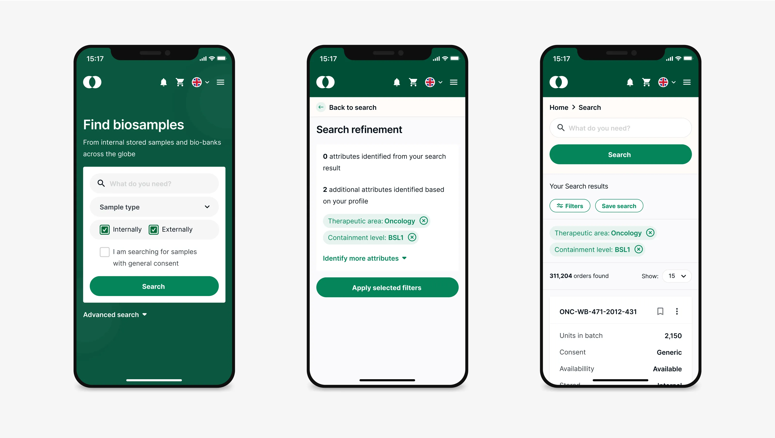
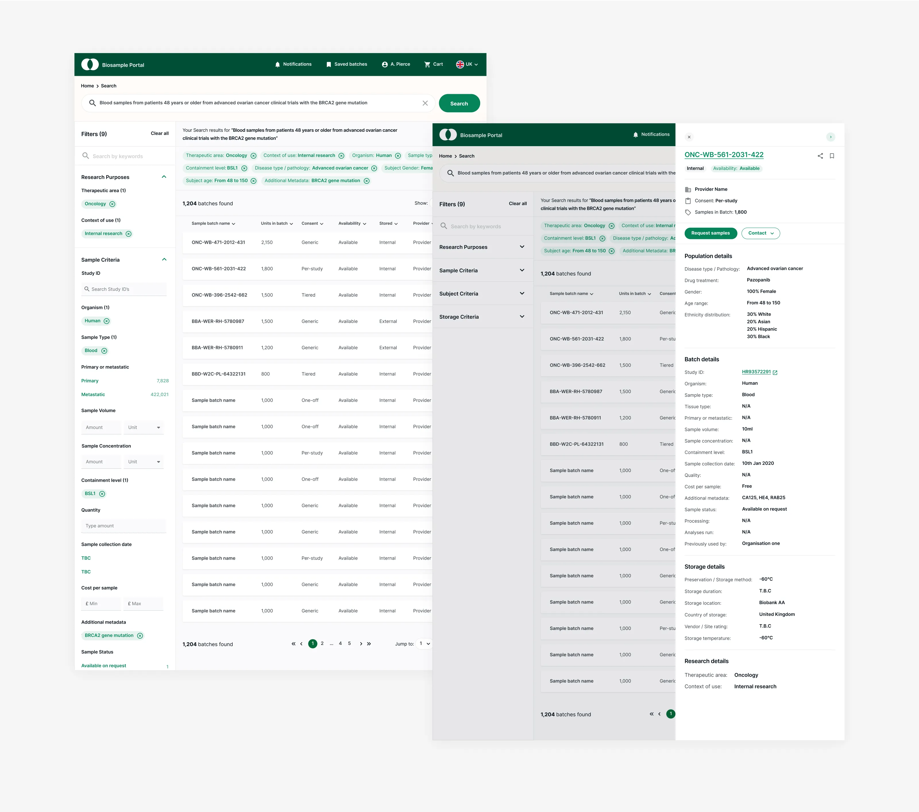
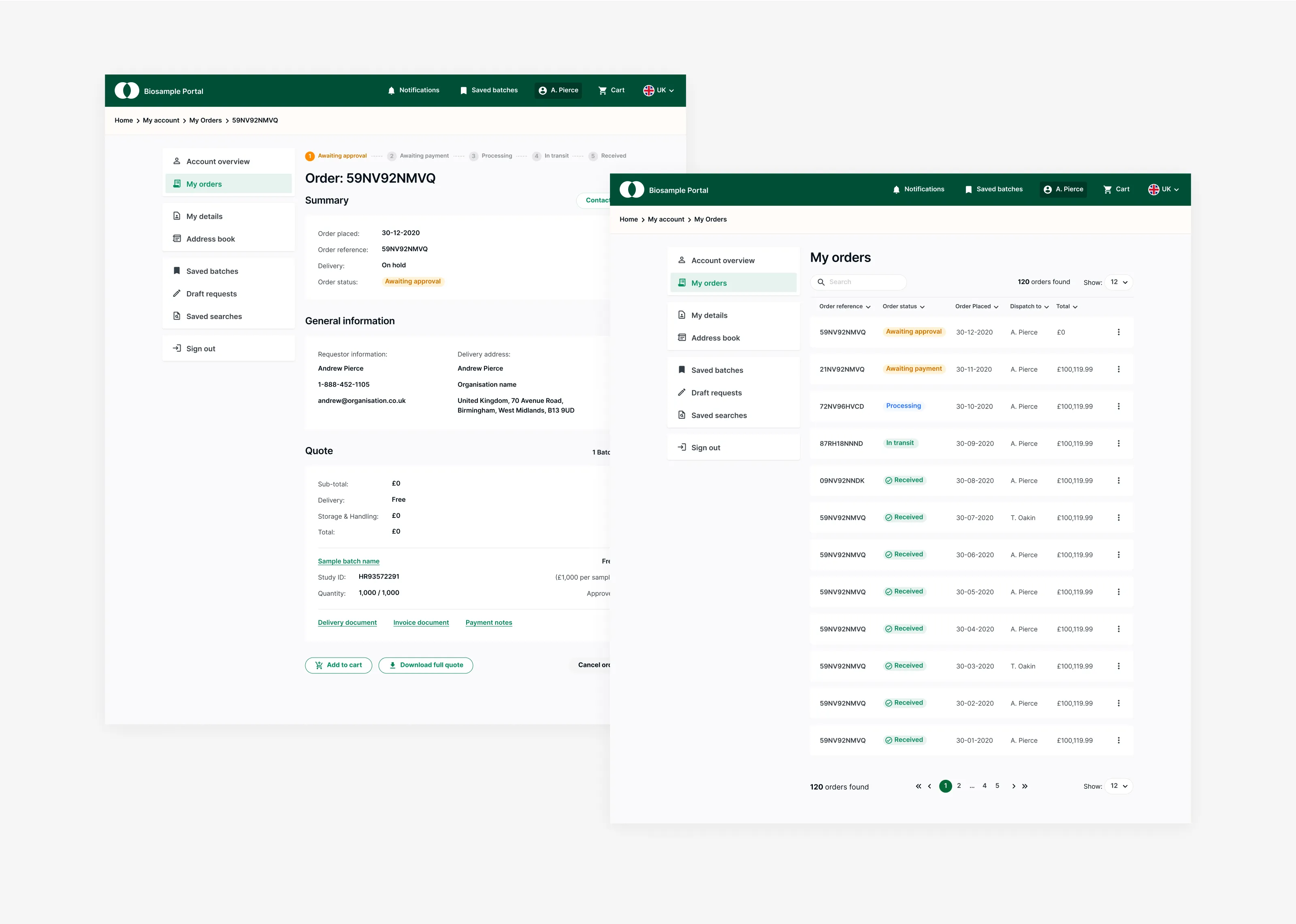
A search and filtering experience grounded in scientists’ domain language and workflows. Responsive wireframes and prototypes that connected discovery, request, and approval in a single flow. Clear metadata presentation for faster assessment of sample relevance and availability. Prioritised features that balanced usability with technical feasibility, shaping the MVP backlog.
Results
Delivered a validated concept that demonstrated feasibility and user desirability. Scientists reported reduced ambiguity in search and stronger confidence in results during testing. The platform positioned Roche to increase internal sample usage, reduce costs, and save scientists’ time. The design team provided a clear artefact for development, accelerating decision-making and scope definition.
My process
Research activities
Facilitated workshops with stakeholders and scientists to define the user journey and feature priorities. Reviewed scientific repository systems and adjacent domains to understand patterns.
Definition activities
Mapped user journeys. Prioritised functionality. Established information architecture hypotheses.
Design activities
Wireframes and responsive prototypes covering search, filtering, request flows, and dashboards.
Testing activities
Ran card-sorting and IA exercises to organise categories and metadata into a usable structure. Synthesised insights into candidate flows and validated with quick prototype reviews.
Iteration activities
Refined flows and layouts.
Handoff activities
Prototype. Information architecture. Design rationale. Prioritisation recommendations for MVP vs later releases.
Research
Insights in the beginning
Search must be flexible but guided, with filters that map directly to scientific concepts. Scientists valued clarity of metadata (origin, condition, viability) more than UI aesthetics. Workflow integration (request → approval → fulfilment) was just as critical as discovery. Information overload risk: too many filters without hierarchy slowed progress.
What we would track post-launch
Search success rate and task completion time. Percentage increase in use of in-house vs external samples. Scientist satisfaction (usability/NPS for the platform). Reduction in redundant or duplicate requests.
Key decisions
Information architecture anchored in scientist workflows
Design navigation and filters around sample type, condition, and source, mirroring scientific categorisation — this was to align with mental models and reduce friction in search.
Guided filtering and progressive disclosure
Prioritise common filters upfront, defer advanced parameters into expandable controls — this was to prevent overwhelming new users and preserve depth for advanced searches.
Metadata clarity and trust
Surface provenance, condition, and availability clearly in results; use consistent visual language for sample states — this was to build trust and reduce wasted time requesting unusable samples.
Request flow integration
Connect discovery to request, approval, and fulfilment within the same platform — this was to reduce drop-off and ensure continuity of workflows.
Prototyping to support scope
Produce responsive prototypes to visualise user journeys end-to-end — this was to give stakeholders concrete artefacts to discuss scope, feasibility, and priorities.
Risks and how they were managed
Domain complexity
Mitigated through frequent SME input and card-sorting exercises.
Feature creep
Kept scope tight by prioritising high-value filters and flows for MVP.
Information overload
Designed with progressive disclosure, allowing depth without clutter.
Designing a client’s web portal for supply chain diagnostics
I designed a web portal that integrates with Bluetooth Low Energy (BLE) devices on CHEP pallets, providing customers with data-driven visibility into the condition and location of their items throughout the supply chain.