Designing a client’s web portal for optimising call centres
My role
Visual Designer
Year
2020
Introduction
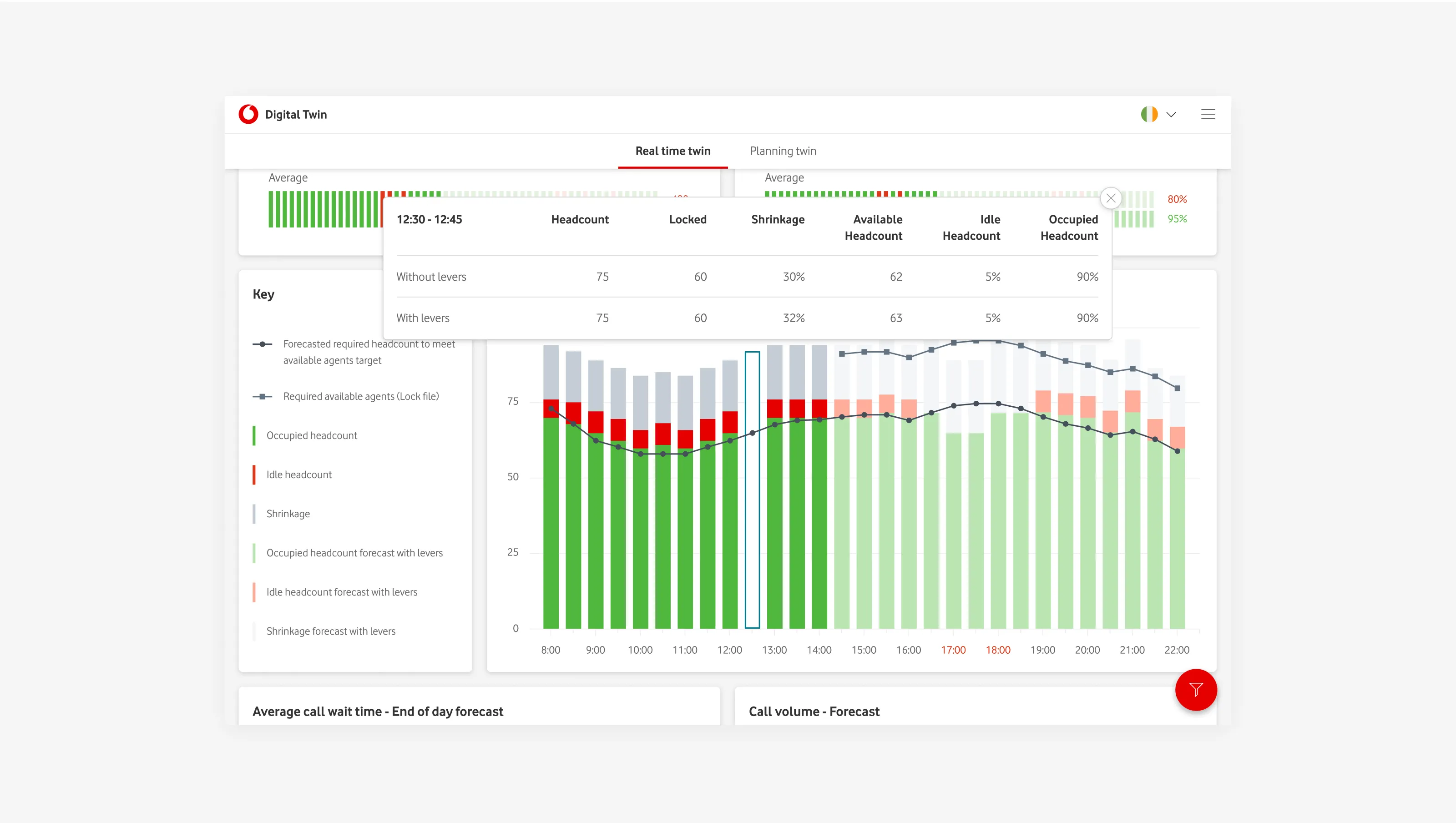
I designed Vodafone’s call-centre optimisation tool, turning end-to-end wireframes into production-ready UI for desktop and mobile and extending the design system with data-dense components. The experience gives managers a clear view of current vs target performance and lets them model quick “what-if” scenarios before reallocating staff or re-routing queues. I delivered interactive prototypes and detailed specs that reduced build ambiguity, supported accessibility, and improved decision speed on the operations floor.
Client
Vodafone
Sector
Telecommunications
Project team
Project Manager
Visual Designer
UX Designer
Timeline
2 weeks
Constraints
Align with Vodafone’s design system. Support high-density data without sacrificing legibility. Provide parity across desktop and mobile where feasible. Accessibility in enterprise contexts.
Overview
Problem
Managers lacked a single place to: see live performance against targets and quickly model staffing changes to avoid SLA breaches and excessive wait times. Existing tools forced them to stitch together dashboards and spreadsheets, slowing decisions and increasing the risk of over or under-staffing.
Challenge
Make live performance vs targets understandable at a glance. Enable rapid “what-if” adjustments and show projected impact before committing. Keep actions (re-assign, re-route, schedule) close to insight to reduce context switching. Deliver specs that speed implementation and reduce rework.
Solution
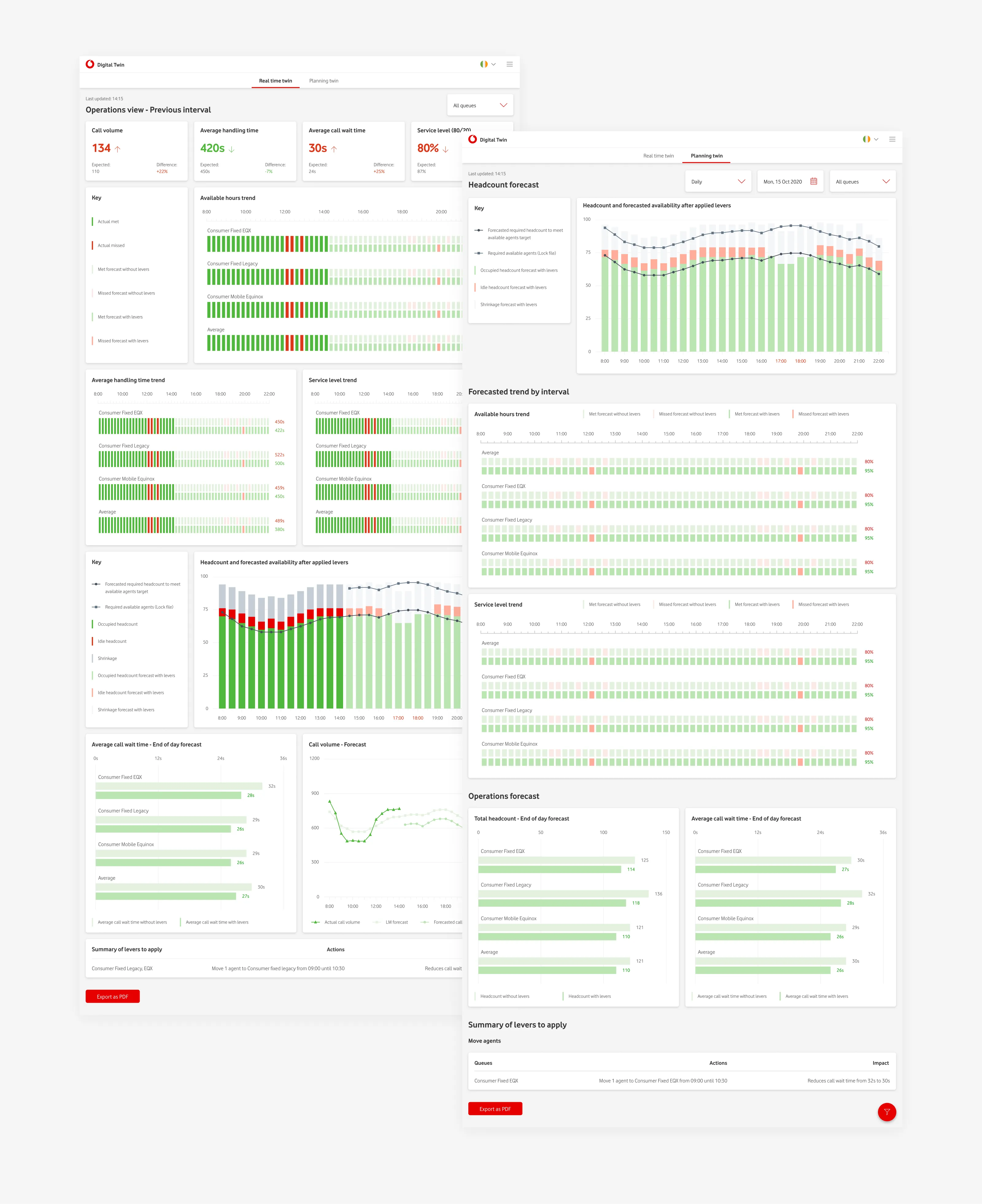
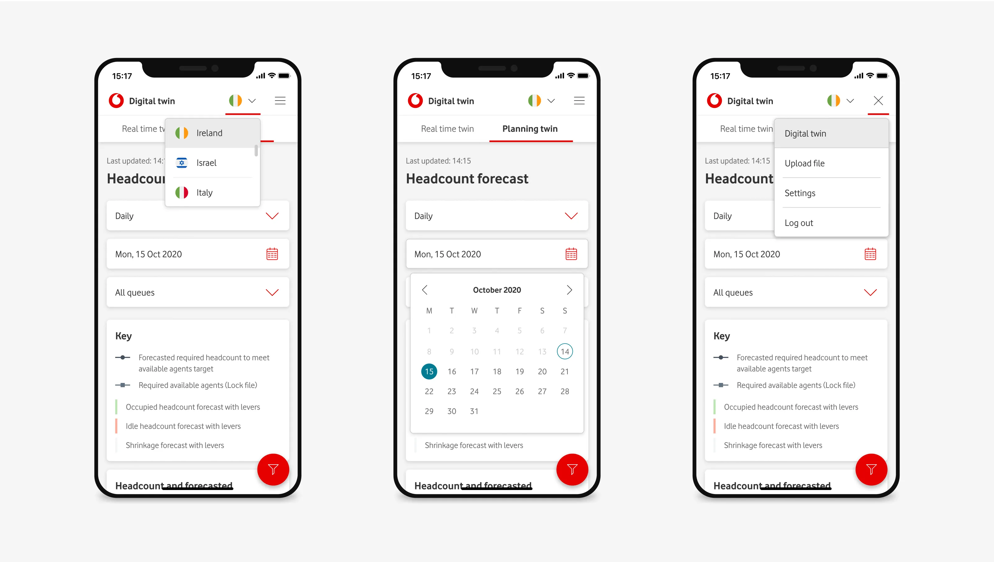
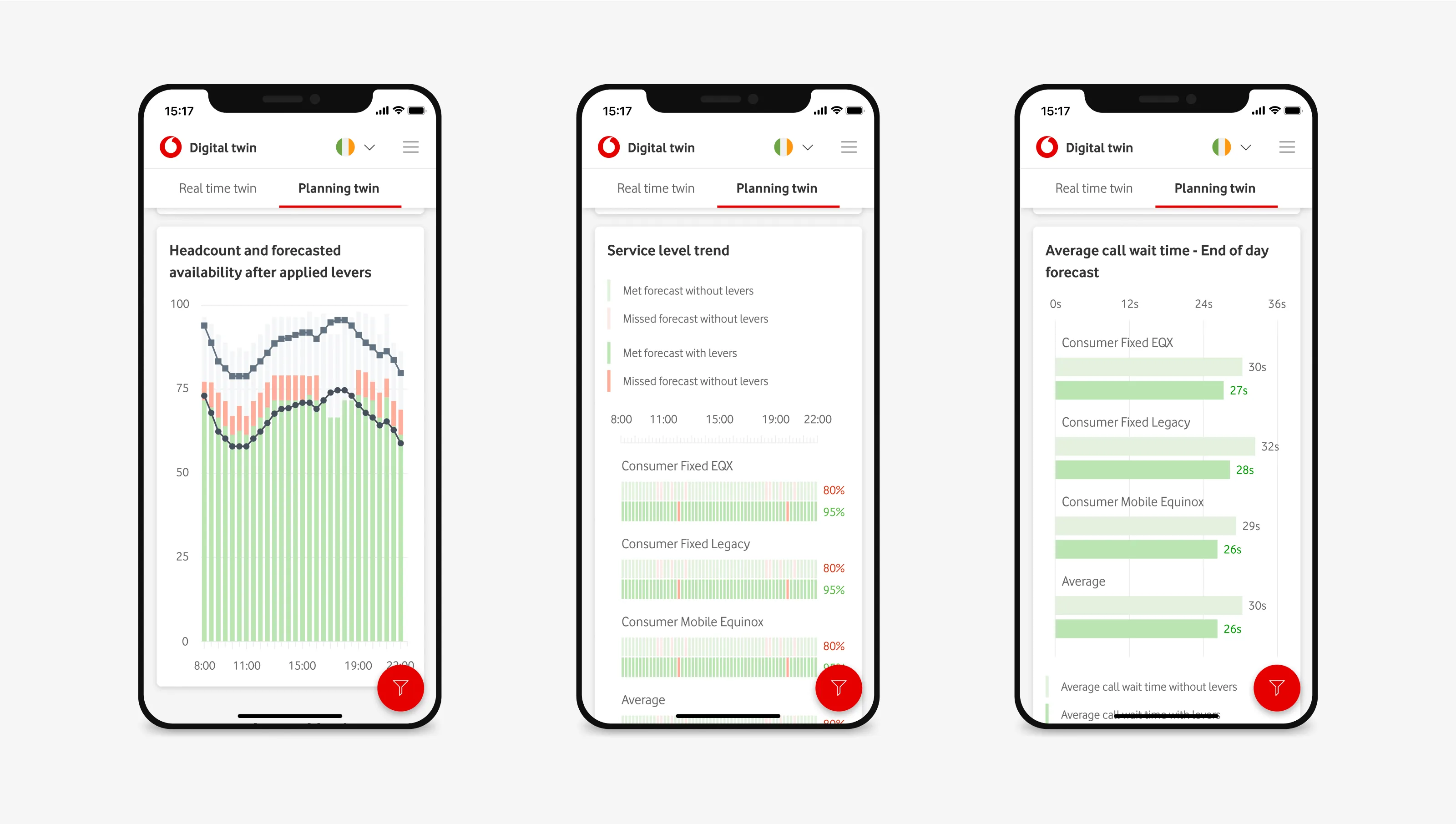
Performance overview: current vs target KPIs with variance and trend. Queue health: heat-mapped queues with drill-downs to drivers and backlog. Scenario model: adjustable controls with projected KPI deltas before committing. Workforce actions: inline reassignment and scheduling prompts anchored to affected queues/skills. Mobile view: condensed status and critical actions for floor management.
Results
Clearer visual hierarchy reduced scanning time during reviews and incident response. Scenario controls enabled pre-emptive moves (reassignment/re-routing) rather than reactive firefighting. Contributions to the design system (components and tokens) improved implementation velocity and future reuse.
My process
Research activities
Current-state review of wireframes and requirements. SME walkthroughs to map decision points (e.g. “When do you add a shift vs re-route calls?”). Inventoried KPIs and thresholds. Heuristic evaluation for data-heavy UIs (legibility, grouping, density).
Definition activities
Established information hierarchy and interaction patterns. Identified gaps in the design system.
Design activities
Produced high-fidelity layouts and interactive prototypes for desktop and mobile. Created new system components where needed.
Testing activities
Stakeholder reviews with ops leads. Feasibility checks with engineering for data freshness and interaction costs.
Iteration activities
Quick iteration cycles to confirm readability and control behaviour.
Handoff activities
Developer-ready specs (layouts, tokens, states, behaviours). Additions to the design-system library.
Research
Insights in the beginning
Managers think in scenarios (“What happens if I move two agents to Queue B for the next hour?”). Information overload was slowing action; data needed clear hierarchy and progressive disclosure. Mobile needed a condensed, glanceable view for floor walks and on-the-go checks.
What we would track post-launch
SLA attainment. Average handle time. Abandonment rate. Forecast error. Schedule adherence. Time-to-decision after alert. Usage of scenario controls.
Key decisions
Dashboard with immediate comparatives
Live KPIs presented as current vs target vs variance with trend indicators — this was so that managers could spot risk within seconds without drilling into information.
Scenario controls for forecasting
Lightweight controls (e.g. time window, agent reassignment, queue thresholds) that preview projected impact before applying — this was to support “what-if” thinking and reduce costly trial-and-error on live queues.
Progressive disclosure for density
Overview surfaces critical signals; drill-downs reveal queue, skill, and agent-level details — this was to keep the main canvas readable while preserving detail when needed.
Action proximity
Primary actions (re-assign, re-route, schedule) appear inline with the data they affect — this was to reduce context switching and speed up time-to-action.
Design-system extensions
Added high-density table variants, status chips, and forecasting controls; codified tokens and states (idle, warning, breach) — this was because creating reusable patterns for data-heavy operations; improved consistency and build speed.
Accessibility & clarity
Colour-independent status cues (icons, labels), keyboard navigation, and readable data at enterprise densities — this was to ensure reliability and inclusivity in mission-critical contexts.
Risks and how they were managed
Data latency
Aligned UI expectations with refresh intervals. Designed states for stale data and fallbacks.
Over-density
Validated table density and typography with SMEs. Added quick filters and column presets.
Designing a client’s loyalty program for their mobile app
I designed an account experience in the mobile app to give moviegoers a clear incentive to sign up and engage with Filmstaden, helping increase ticket and food counter sales.