Designing a client’s loyalty program for their mobile app
My role
Visual / UX Designer
Year
2020 – 2019
Introduction
I led a four-week redesign of Filmstaden’s loyalty and “My Pages” experience across iOS and Android to increase sign-ups and attach rates for tickets and concessions. After auditing the current flows and aligning on success signals, I reframed the value proposition, simplified and sequenced sign-up, re-architected “My Pages” around frequent tasks, and added contextual purchase prompts. We prototyped, tested, and iterated quickly; participants reported higher clarity and motivation. The work shipped with developer-ready specs and a clear measurement plan to track conversion, repeat use, and attach rate.
Client
Filmstaden
Sector
Movie theatres
Project team
Project Manager
Visual / UX Designer
UX Designer
Timeline
6 weeks
Constraints
Parity across iOS & Android. Keep scope focused enough to build.
Overview
Problem
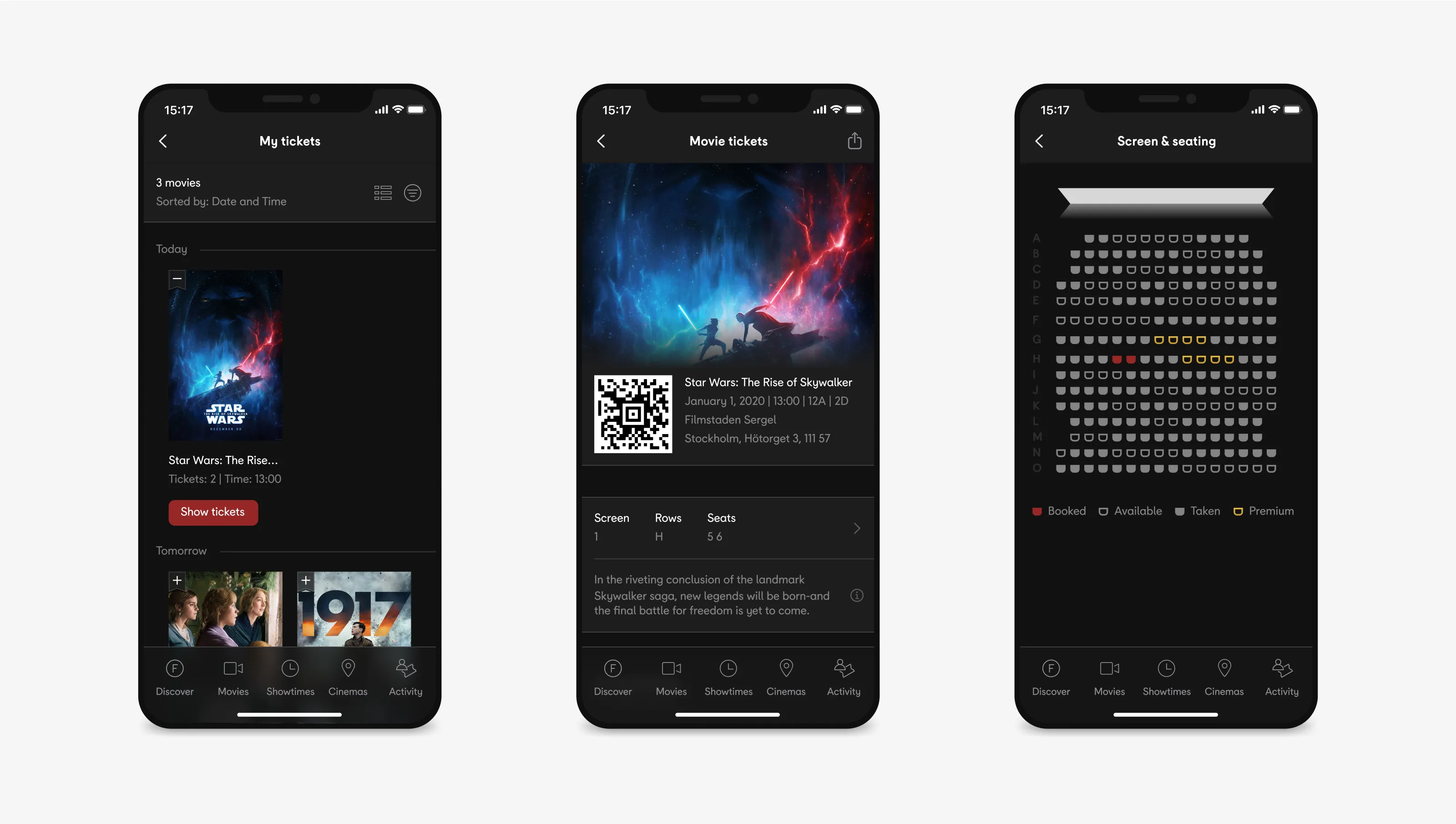
The apps offered limited motivation to join or engage with the loyalty programme. The sign-up journey was long and generic; “My Pages” mixed account admin with loyalty content, burying common tasks. The business goal was twofold: increase loyalty sign-ups and drive more ticket and concession purchases.
Challenge
Make the value of joining obvious at entry. Reduce friction in sign-up (steps, errors, uncertainty). Restructure “My Pages” so frequent tasks are immediate. Introduce contextual prompts to increase attach rate for tickets/snacks.
Solution
A benefits-first entry to the loyalty programme with clear reasons to join and what to expect. A guided sign-up flow with fewer steps, inline validation, and visible progress; non-critical fields deferred. A re-architected “My Pages” with quick actions and clear sections (Rewards, Activity, Tickets, Account). Contextual prompts that link loyalty moments to purchase flows. Robust states and error handling documented for implementation. Platform-specific UI with shared logic to balance parity and native usability.
Results
Participants found the join flow clearer and faster, with fewer hesitations. Users better understood loyalty benefits and progress, increasing stated intent to join. Navigation of “My Pages” improved; common tasks were discovered and completed more quickly. Contextual prompts were perceived as helpful rather than intrusive when timed to intent. Developer-ready specifications reduced ambiguity and rework.
My process
Research activities
Current-state audit of sign-up, loyalty touchpoints, and “My Pages”. Heuristic review against mobile UX and loyalty best practices. Mapped pain points. Light stakeholder interviews to capture constraints and success signals. Captured business goals and technical constraints.
Definition activities
Set design principles and success signals. Prioritised scope to fit four weeks.
Design activities
Produced information architecture. Produced user flows. Produced high-fidelity, platform-specific prototypes.
Testing activities
Ran qualitative, scenario-based testing on join, benefits comprehension, navigation, and purchase prompts with interactive prototypes.
Developer-ready specs with states and edge cases. Findings report and next-step roadmap.
Research
Insights in the beginning
The value proposition for joining was fragmented; benefits were not visible up front. Sign-up mixed critical and non-critical fields, with unclear progress and distracting CTAs. “My Pages” lacked a clear IA; common tasks were slow to find. Minimal cross-sell prompts within loyalty contexts to nudge ticket/snack purchase.
What we measured during the project
Task success. Time on task. Hesitation/error points. Stated clarity and motivation in usability tests.
What we would track post-launch
Sign-up conversion and step-level drop-off. “My Pages” feature usage/return rate. Ticket and concessions attach rate from redesigned paths. NPS/CSAT for members.
Key decisions
Lead with benefits before effort
Add a benefits-forward entry screen with concise copy, preview of rewards, and FAQs — this was because motivation rises when users see value before forms.
Shorten and sequence the sign-up
Break long forms into guided steps with progressive disclosure, inline validation, and persistent progress — this was to reduce abandonment and cognitive load and preserve momentum.
Separate concerns in “My Pages”
Reorganise IA into clear sections: Rewards, Activity, Tickets, Account; with quick actions above the fold — this was so that frequent tasks become fast and users didn’t hunt through mixed content.
Contextual purchase prompts
Surface ticket and snack prompts at moments of intent (e.g., after checking points or activity) — this was to increase attach rate by meeting users where motivation is highest.
Error handling and recovery
Specific error copy, saved progress, and obvious recovery paths — this was to protect users effort and reduce drop-offs from avoidable errors.
Platform parity with native feel
Shared patterns and behaviours adapted to iOS/Android conventions — this was in order to have consistent mental models, without breaking platform expectations.
Risks and how they were managed
Scope creep in four weeks
Impact/effort triage, staged backlog.
Platform divergence
Shared pattern library plus platform-specific components.
Overloading “My Pages”
Clear information architecture and visible quick actions to keep tasks immediate.
Designing a client’s mobile app for drivers of their vehicles
I designed a mobile app that is giving drivers the information they need about their vehicle, exactly when they need it, helping them make better decisions and enjoy a safer, simpler workday.