Komponera: Designing IKEA’s headless CMS for scalable digital content operations
My role
UX Designer / Design Lead
Year
2022 – 2021
Project details
Client
Inter IKEA
Sector
Retail
Project team
13-person cross-functional product team, including Product Owner, Business Analyst, Agile Coach, Solution Architect, Front-end Developer, Back-end Developer, QA Tester, Visual Designer and users from IKEA’s content organisation.
Timeline
62 weeks
Overview
I led design for Komponera, Inter IKEA’s headless content management system for digital content operations.
The product was part of IKEA’s shift away from a print-first production model, following the closure of the catalogue, toward a more scalable digital content ecosystem. The ambition was to support a “create once, publish anywhere” approach: enabling teams to create structured content once, reuse it across channels and markets, and reduce the manual effort involved in producing shoppable digital experiences.
Before Komponera, content production relied heavily on InDesign specification files, manual product annotations, handoffs to web teams and repeated version control. This created long lead times, duplicated effort and a workflow that was difficult to scale globally.
My role was to help turn that broad transformation goal into a usable product experience for content creators, metadata taggers, publishers and adjacent teams across the content lifecycle.
The problem
IKEA’s existing content production workflow was manual, document-heavy and difficult to scale.
Art directors and content teams created specification files in InDesign, manually placed shoppable markers onto images, annotated visible products by ID, and handed those specifications over to web teams for implementation.
The process worked, but it created repeated admin, versioning issues, long feedback loops and dependency on handoffs. As IKEA moved further into digital content operations, this workflow needed to evolve into a structured system that could support reusable content, localisation, governance and global-to-local publishing at scale.
The challenge was not simply to design a CMS interface. It was to replace a manual production process with a workflow product that could support multiple roles, repeated high-volume tasks and a more scalable content operating model.
My role
I was the UX lead on the product team, responsible for turning broad business and transformation goals into clear product workflows.
My work covered:
clarifying the product problem with the team
mapping content creation and publishing workflows
defining user needs across different roles
designing end-to-end experiences for bounding box, shoppable image and room-based workflows
creating wireframes and prototypes
testing designs with users
producing developer-ready specifications
supporting implementation QA
contributing to the internal tooling design system
onboarding another designer as the design scope matured
establishing design reviews and rituals to keep the cross-functional team aligned
I worked closely with the Product Owner, Business Analyst, Solution Architect, developers, QA and users throughout the project.
Understanding the workflow
The core users were operational metadata taggers and web publishers. However, the workflow also involved art directors, copywriters, SEO specialists, marketing managers, approvers, content strategists and downstream market teams.
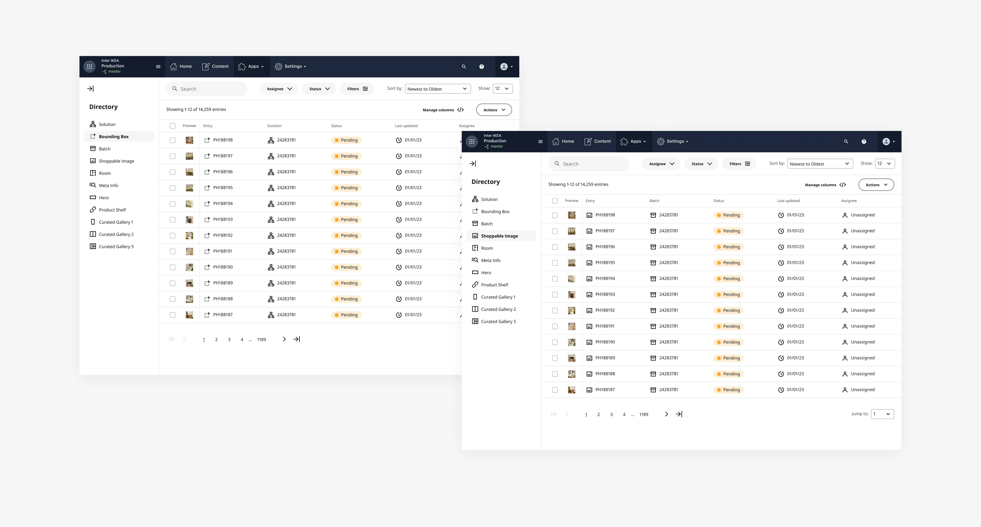
Different people touched the same work item at different stages, which meant the product needed to make ownership, status and next actions clear.
A single asset could move through multiple stages: from being associated with a room setting or solution, to product tagging, metadata enrichment, shoppable marker placement, review, publishing and distribution.
This made the workflow more complex than a single-user editing tool. The design needed to support collaboration, task progression and confidence across a shared operational process.
From transformation goal to product direction
One of the first challenges was making the ambition practical.
The wider strategy was clear: IKEA needed to move from manual, print-influenced content production to structured digital content operations. But the product team still needed to understand what that meant in everyday workflow terms.
I started by reviewing existing strategy and documentation, understanding the wider content ecosystem, and mapping how content moved between teams and systems. Komponera sat between several parts of that ecosystem, including asset management, product data, CMS functionality and publishing.
This helped us move from a broad transformation goal into more actionable product questions:
Who are the primary users?
What work do they need to complete?
What information do they need at each step?
Where is repeated effort happening?
Which tasks require human judgement?
Where can structure, reuse or automation reduce friction?
What constraints do we need to respect from Contentful, asset management and product data systems?
From there, I worked with the team to define workflows, prioritise features and shape the direction of the product.
Example workflow: creating a shoppable image
One of the key workflows I owned was the process of turning a photoshoot asset into a shoppable image.
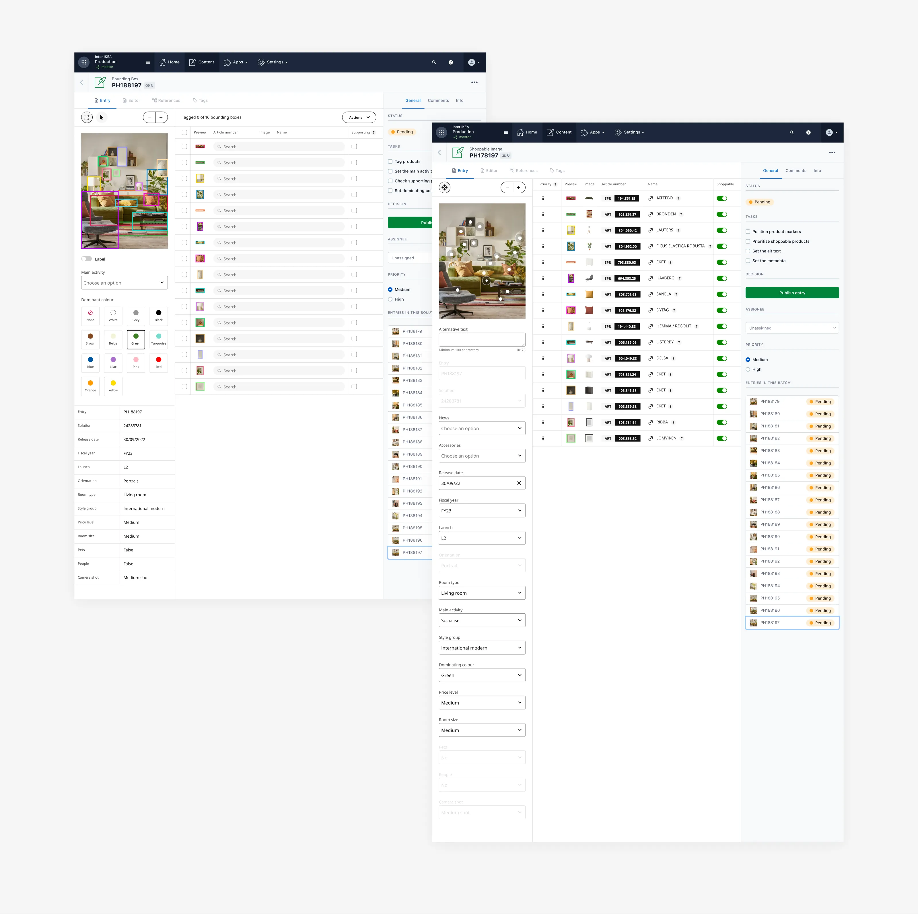
A work item would enter the system associated with a solution or room setting. In the bounding box stage, users needed to identify and tag the IKEA products visible in the image, set the main activity, define supporting products and add relevant metadata such as dominant colour.
Once that stage was complete, the content could move into the shoppable image workflow. Here, users positioned product markers, prioritised products, added alt text, checked metadata and prepared the content for publishing.
A key challenge was that different users could work on different parts of the same item. The product needed to make the current state of the work clear, show who owned the next step, and help users move through repetitive tasks efficiently without losing confidence.
Key design decisions
Make status, ownership and next actions visible
Because the same content item moved between roles, users needed to understand what state an item was in, who was responsible for it, and what needed to happen next. I introduced patterns for task visibility, status and assignment so users could quickly understand where they were in the workflow and what action was required. This helped reduce ambiguity and turned a multi-person process into something easier to manage inside the product.
Use context to reduce product selection effort
Tagging products manually could become slow and repetitive, especially when users were working across large volumes of imagery. Rather than asking users to search across IKEA’s full product range every time, I used available context, such as the solution number, to narrow product options and make selection faster. The goal was not to remove user judgement, but to reduce unnecessary search effort and help expert users move faster through repeated tasks.
Keep users confident without overloading the interface
When users were unsure about a product selection, they needed a way to verify it rather than guess. I designed links into IKEA’s product information system so users could confirm product details in context. This supported accuracy without overloading the CMS interface with every possible piece of product information.
Prioritise speed for repeated-use workflows
Early in the project, I assumed that first-use clarity should be the main priority. As we tested and observed the product in use, it became clear that repeat users cared more about speed, efficiency and confidence. These users were often working through large volumes of content. A pattern that felt simple on first use could become slow over time if it hid too much information or required unnecessary steps. That shifted the design direction toward workflows that supported repeated use: keeping relevant context visible, reducing unnecessary navigation and making high-frequency actions easier to complete.
Avoid automation where it created review burden
We explored automation in parts of the tagging workflow, including product auto-tagging. However, user feedback showed that reviewing imperfect automation could be slower than tagging manually, especially because users already had strong product and domain knowledge. This became an important design principle for the project: automation should reduce total effort, not simply move effort from creation to review. The experience was therefore designed to keep humans in control while creating a stronger foundation for future automation when the technology and data quality could support it.
Designing with technical and system constraints
Komponera needed to work within a wider ecosystem of content, asset and product data tools. Many design decisions depended on what data was available, how reliable it was, and how the front-end and back-end systems could support the workflow.
I worked closely with developers and the solution architect throughout the process to understand constraints, discuss trade-offs and make sure the design could work in production.
We also made a conscious decision to branch from IKEA’s main design system where internal tooling needs differed from consumer-facing experience needs. Komponera required dense workflows, data-heavy screens, task management patterns and repeated-use interactions that were not always covered by consumer-facing components.
To support this, I helped establish a Figma-based internal tooling design system with reusable components, patterns and documentation. I also introduced design QA into the delivery process to reduce design-development drift and improve implementation quality.
Research, testing and iteration
We had strong access to users throughout the project. I used a combination of workflow walkthroughs, usability sessions, demos, biweekly check-ins and feedback from user representatives to validate and improve the product.
Several important changes came directly from user feedback:
shifting the interface from first-use clarity toward repeated-use speed
refining status and assignment patterns
improving product selection and verification flows
avoiding automation where it increased review effort
adjusting workflows to better match how users thought about content production
The feedback loop was continuous: demo, gather feedback, iterate, and replay the updated direction with users and the team.
Outcome
By the time I rolled off the project, the bounding box to shoppable image workflow was live and in use, and shoppable images had started reaching the Swedish market through the new process.
The work helped move IKEA away from manual specification documents and toward a structured CMS workflow. It reduced reliance on document-based production, gave content creators a clearer way to progress work through the system, and created a stronger foundation for reusable content, global-to-local publishing and future automation.
The design system, rituals and QA practices also helped improve design maturity within the product team and created a more consistent foundation for future internal tooling work.
I do not have a clean before-and-after metric for the full operational impact, so I am careful not to overstate the results. The clearest impact I can point to is that a previously manual, handoff-heavy workflow became a live product workflow that supported structured content creation and publishing at scale.
What I learned
This project changed how I think about internal tools.
For repeated-use operational workflows, the best design is not always the one that looks simplest at first glance. The better solution is often the one that reduces friction over time, supports accuracy, preserves context and gives expert users confidence.
I also learned that automation needs to be judged by the total effort it creates or removes. If users spend more time reviewing and correcting automation than they would doing the task themselves, the experience has not improved.
If I were approaching the project again today, I would push earlier for stronger success measurement and revisit automation using current AI and multimodal capabilities. I would still keep humans focused on quality, intent and exceptions, but I would explore more ways to reduce repetitive production work where the system could genuinely support users better.
Reflection
I chose this project for my portfolio because it reflects the kind of product design work I enjoy most: taking an ambiguous, system-heavy problem, understanding the real workflow behind it, and turning it into a useful, scalable product experience.
It required product thinking, interaction design, systems thinking, close collaboration with engineering, and careful trade-offs between clarity, speed, automation and control.